“Live Progress” posts were meant to come out every 1-2 weeks. Progress is slower these weeks because of real-life changes I’m going through, so now I’m trying to catch up with the schedule. To the facts!
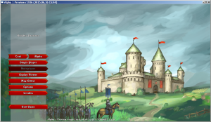
I’ve been refactoring menus to allow for simpler management and layout changes, including background images. Thanks to Natalie’s talents, we now have our first sexy menu background:
 It is still a sketch, but it improves the feel of the game in the menus tenfold!
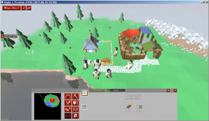
House building supplies are now rendered on the building sites:

Supplies layout is the same for all the houses, but each house can have them positioned differently. The neat thing, is that the game reuses same wares models for all occasions – house supplies/production in houses, serfs carrying, building supply.
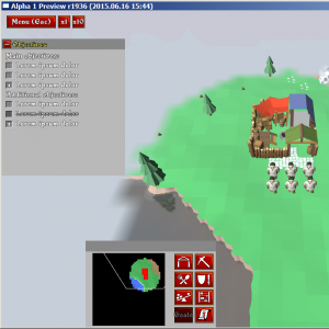
Jery is working on in-game objectives display. Those are handy short notes on the side that tell you what needs to be done to win the mission. Kind of like RPG quests – main and additional. This should make winning conditions much more clear:

Still work in progress, the graphics and layout will surely change later on. Objectives display is purely GUI thing and should be updated from the dynamic script. The script will be responsible for objectives logic. For multiplayer and mapmakers who do not want to dive into scripting – standard goals will create standard objectives as well.
Finally, Alpha plans are likely to slip on to the next month, due to me being so very busy with real-life stuff.

Good to see a progress! Menu looks really nice, sketch is very pretty and I like how exit button points other direction than the rest (nice detail :)).
Thanks Tiank, glad that you have noticed it 🙂
Menu buttons are specifically designed in 4 different shapes to indicate the action
<<>> general action
>> action that causes progress into the menu/game
<< back/return [] game controls and small buttons
Screenshots are too damn small! Still, glad to hear on the progress!
Hi Ray,
Indeed, I got used to working on KP in windowed mode, around 1280 x 800 to make sure everything fits into small displays. Gonna make a note to take a few fullHD screens, thanks!
That menu has a real Knights and Merchants feel to it.
Very well done.
This game is going to be awesome.
Hi Zombie01,
Sorry, no KaM connections here, KP will have a nice menu background, unlike grim stones in TPR 😉
Hi Krom,
I know it’s Knights Province 😛
But it’s a spiritual succesor, so it’s a good thing if the menu and the background have a certain KaM feel to it.
I can’t wait to test the alpha.
Hi!
I love this very much!! It seems just really nice!
Can you guys make a kickstarter page? That would be awesome! I would sure donate!
Hey Joman,
Thanks for comment!
KP is yet too raw and early in development to start a KS page. We’ll try to find other ways to let people help with the development 🙂
Hi!
It seems good 😀 very good 😀
When’ll finished it? 🙂
Wll be more buildings and people as in KaM?
Languages? Hungarian version? 😀 What the story? Plan you multiplayer?
Now I’ve minimal internet, but in the next year I go back to KaMR multi.
Best wish!
Hey tgwh, what a strange nick you have got!
Public Alpha is hopefully coming soon (several weeks). Complete game … that’s a tough one to answer, maybe several years, depending on circumstances and such.
Unit and house count is yet unknown, I think it will be comparable.
Localization sub-engine is in-place, but it is better to hold off the languages until the game is at least in Beta stage. A lot might change till then.
The story is yet missing, but I’m sure it will have to do something with the knights and provinces 😀
Multiplayer is planned, but no promises about its complexity yet.
Thank you for interest in KP and these questions! 🙂
See you around! 😉
Is it possible to get access a little bit earlier (._. ) ?
The Alpha is still being prepared 🙂
Well, waiting for it ^^”