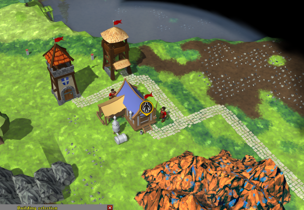
After watching second part of Knights Province play (https://www.youtube.com/watch?v=33tjOSoJfNQ) I’ve decided to look into house notifications. As of Alpha 7.1, they indicate when a house if missing a worker, or a connecting road (these are 2 very popular situations for new players). In Alpha 7.1 those notifications are rather vague and easy to miss in the background. So I’m drawing new icons for them. Here is the style:
Icons are good at attracting attention, as they should, but I’m not entirely happy about the style – it looks a bit “artificial”.
Key thought on the matter:
- games do have artificial elements all over them (take “magic” GUI for example).
- a town with dozens of these icons could look “crowded”.
- this is an RTS, genre where you need to manage a lot of different things and every help from the game is appreciated.
- “float-above” notifications are more affordable than arriving messages, which need to opened, read, clicked “go to”, finding an outlined/highlighted house and only then seeing a problematic house.
- perhaps notifications can become houses “thoughts”. I need to think more in that direction ..
Until then, this is what I’ve been working on today (and refactoring controls render overall) 🙂


It looks fine IMO.
It’s clear but not scream-ish.
Maybe make the yellow a slight bit darker.
Exactly the same thought..
impressive job dude.
Can I give you a hand to complete the game? I’m a programmer and I know Java and C#.
The game is being written in Delphi (Object Pascal). Do you have experience with it?
Yes, this icon not fits..
Simple solutions:
A: If house is empty – no flag above house
B: Door open all the time (or have small notification on them: Closed)
I think those solutions are too small.
I am sure that I would not notice that during matches.
Maybe.
Anyway.. small mark/alert is enought 🙂
That is a good thing.
You can see it directly.
Make it as customizable as possible. People will choose right setting for themselves(like size of the notifications or its brightness)
Game with a lot of settings is a bad game in my opinion. Imagine how many setting there will be, if every element in the game has such level of customization