Last few weeks I’ve been busy contracting freelancers to make us some more sketches. So let’s see how house design process goes on example of School.
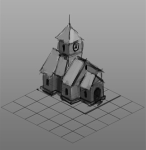
First of all we need references that show us how the school might even look. Usually Google comes to help (“medieval school house” > Search). Then artist draws a couple of sketches:
Those get checked and depending on our luck one or few can be picked, otherwise we need more different sketches. In this case Sketch 1 seemed to look interesting and fit for a small town with over-sized citizens, so it got promoted to a working status.
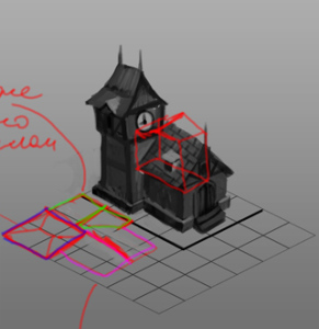
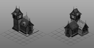
Time to tweak scale and proportions, add support elements.
Secondary enriches the building.
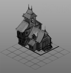
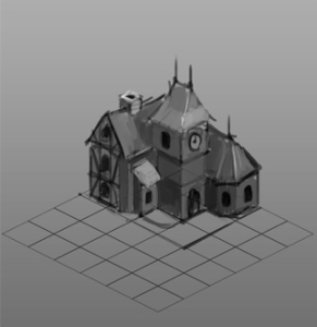
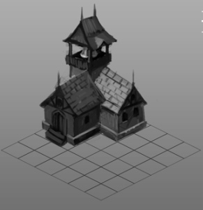
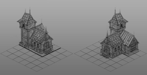
Since School sides come out to look very different, we need a view from the other side (here’s one with an idea for a bell-tower instead of clock-tower):
The bell made it to look much like an alarm tower, so we dropped it (from the height xD).
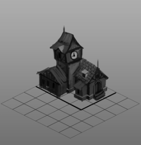
Now there are two synced views which look like a design we need.
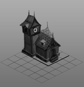
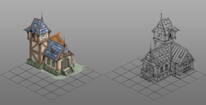
Fine-line drawing stage when forms and shapes are settled and we add more fine details to the house.
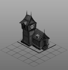
Coloring and materials test reveals that stone hall is too grim and “heavy” – like a prison.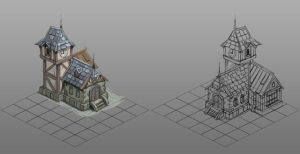
So we changed for a more light classic look
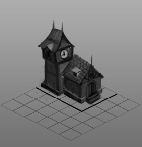
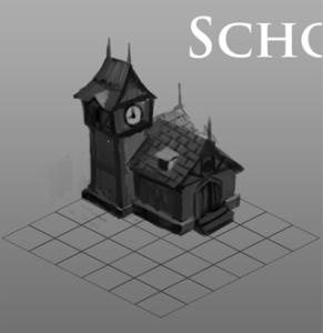
And this is our semi-final result – the Schoolhouse drawing:
Next comes 3D modelling and texturing stage, but that is a whole another topic.

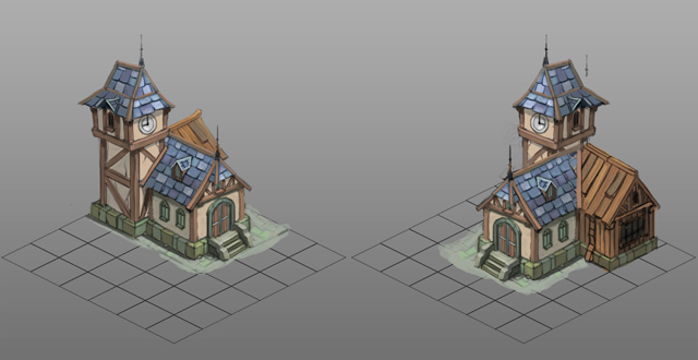
I like it, but the wooden part doesn’t seem to fit with the rest of the building… It looks abandoned and unused. Imo the school should stand proud. 🙂
Looks absolutely gorgeous…except for the wooden part. It looks so out of place; as if it is a graphics bug or something :S
Thanks for comments guys! 🙂
Yeah, wooden parts looks out of place. Perhaps we can get it up to level by making it more accurate and give it a paint job. The plan is to have majority of houses first and then revise them to fit together and fix mistakes like that.
” The plan is to have majority of houses first and then revise them to fit together and fix mistakes like that.”
Good idea. 🙂
“Coloring and materials test reveals that stone hall is too grim and “heavy†– like a prison.”
Well, some would say such prison-like colors suit a school very well 🙂 I like the sketch, gj. Maybe either a paint job on the sides, or slate-made roof just like on the other parts of the school, would make it blend better?
I guess that’s the way to go. I plan to wait till we have more houses and then see how they all look together, before applying tweaks.
For now, let the sketch rest “in the drawer”, so that when we do a big “facebook” mix we don’t have all the history of making it and can judge it from scratch (I’m terrible with formulating, I hope you get what I mean)
чаÑÑ‹ не ÑоглаÑуютÑÑ c иÑторичеÑкой Ñпохой данного проекта, Ñто немалый минуÑ. чаÑÑ‹ – Ñто механизм. колокол гораздо подÑтать ÑмотритÑÑ. кричу и внемлю, Ñотрите Ñие Ñовременное безобразие)
Using a bell on a school has a number of disadvantages:
– hard to see inside the tower when looking from typical perspective
– does not indicate training progress
– looks more like an alarming device
P.S. Wiki says that clock towers were built as early as 1288 (and even earlier).
ваше право выбирать, но Ð¼ÐµÐ½Ñ Ð²Ñ‹ не убедили) вÑе равно поиграю в Ñтот проект)
Nice, but i think ,the shool should be more exceptional, hm?
What do you mean?